

Testing White–The Redemption
Testing White–The Redemption
When an experiment fails, try, try again!

If you have been following along with my experimental journey, you probably saw me attempt to create a white design.
It didn’t work.
Recap:
Across the Picture This Clothing website/ instructional videos, it is suggested to “Design away the white,” which means to put as much color and fun things on the template as possible! This is because the fabric used to create your design is super lightweight and stretchy. It is so so so comfortable! But, if left white, it can look a bit see-through.
I wanted to see this for myself, so I created a super cute shirt using fake flowers, but I placed too many on the template, and they created some cool shadowing across the whole thing. It looked great!
But it wasn’t actually white. So, my experiment didn’t go as planned.
[read the full failed experiment post here.]
I am still quite curious about what happens when you leave white space, though.
Aren’t you?
I decided to do a Testing White Part 2/Redemption Blog.
Take Two, Materials:
The same fake flowers from my first experiment
A template from https://picturethisclothing.com/
Scissors

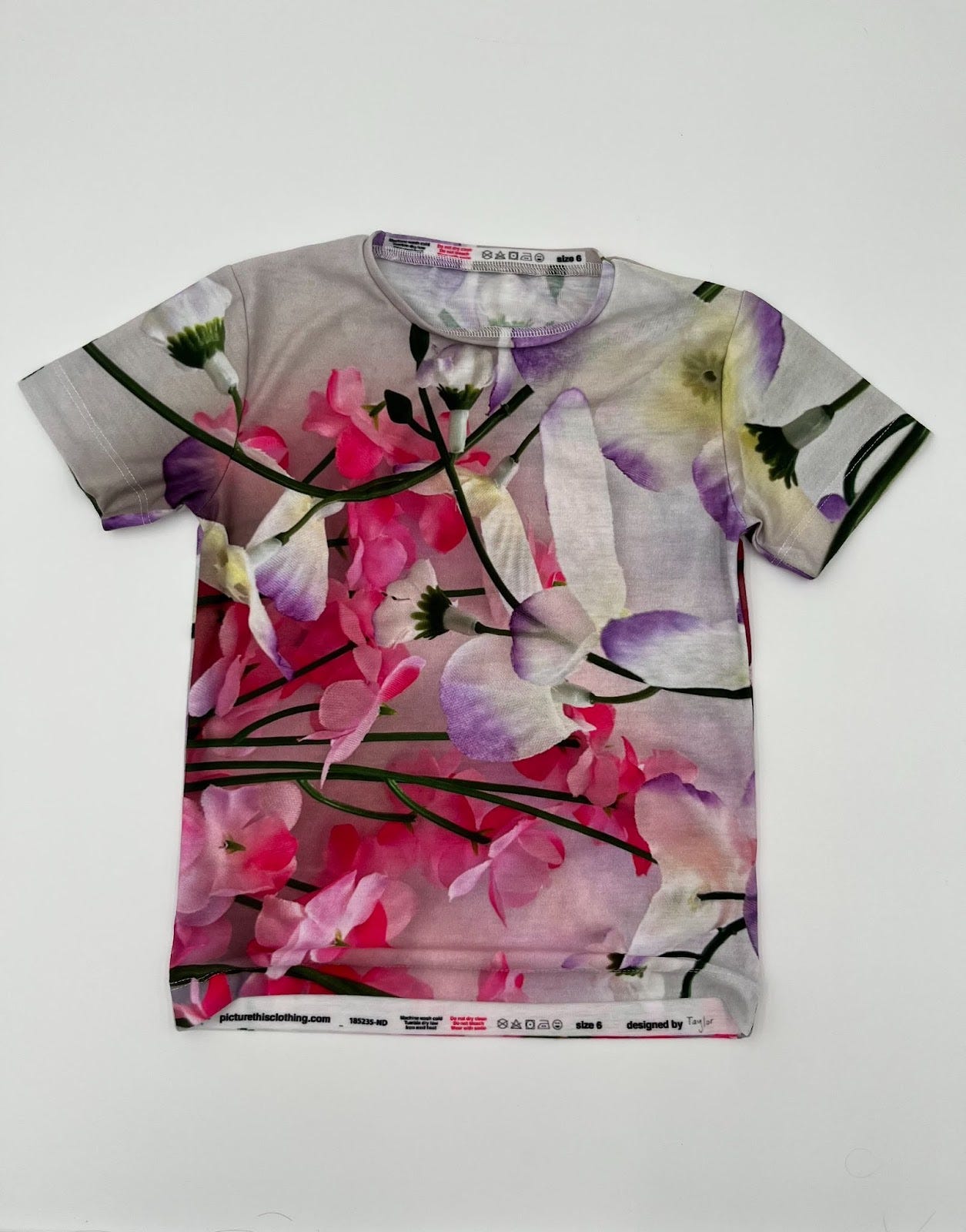
This time, I decided to place the individual flowers instead of the branch of them as a whole.
I took the small flowers and put a few across the shirt.
I made sure to leave plenty of white space around the whole thing.

After I got the flowers in a good spot, I went back onto the Picture This Clothing Website and ordered this shirt!
I think it turned out super well! Not only does the flower placement look good, but there is a ton of white space!

Is the white see-through?
Yes, it is! In the pictures, you can see where the design on the back shows through.
I even put my hand in the shirt to make it more clear.

This was super cool for me to see. I learned a lot about experimenting and re-experimenting. I am pretty excited that this design ended with a positive result!
In the future, I am going to stick to the advice to leave as little white as possible in my designs. Plus, it’s just more fun to use lots of colors!
🥰 Taylor
Hello–It’s Jaimee with a closer this time!
Awesomely, Taylor successfully tested the white, and I love that she tried again after it didn’t work out the first time.
I think it’s an important experiment, and even though I’ve done video examples and we say it as much as possible in as many places as possible, how “white” looks is important to know before designing!
It’s not a cheap fabric, but it is lightweight. I’m pretty selective about what I wear and what we use to make our products. I’m a big fan of higher-end T-shirts. Two of my personal favorite t-shirts are made by the brands: Frame and Free People. Our fabric is comparable to those brands in weight, softness, and stretch.
We use fabric that is milled in the US, which is important to us, and of course, we print, cut, and sew in our little Nevada-based shop. I felt like it was important to explain because sometimes folk assume “see-through” equals “cheap,” but I believe our fabric is pretty amazing. That said, I do encourage folks to make bright, solid, bold designs that eliminate the white space unless you don’t mind it being a bit see-through.
Either way, it’s good to have all the information. And because of that, I love Taylor’s super honest experiments!
I always wear a tank top under white Tshirts so I love how sheer the more white shirt turned out.
That was a great experiment! Both shirts look awesome! We have made a few designs with a lot of white space but definitely prefer to use up as much of the white space as possible. The colors are just so vibrant when printed, even with as many shirts/dresses we have made, we are still in awe at how vibrant the colors are every single time! We look forward to seeing what you design next, you are doing a fantastic job!😀 ~Kimmee